Below are the basic tools required to navigate through you data. For specific details on specific dashboards, see the Dashboards section.
Once logged in to your SupporTrends / Everywhere account, navigate to the Insights -> Visualizations section.
Filters
At the top of all dashboards you will see a variety of common filters that can be used:
- Date Range (selects the conversation date range to be viewed)
- Date Granularity (selects the date increment to be viewed on time series graphs)
- Search (allows you to search for specific terms in your data)
- Entity / Filter Category (allows you to choose a category of content to display in the appropriate dashboard section. Generally all structured data fields are available here)
Once a filter has been selected, refresh the dashboard by clicking this item in the top right:

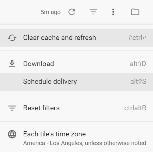
Note that once a query has been run, it will remain in cache for faster performance for up to 24 hours. Therefore, if you are expecting results that may have occurred very recently, you can clear the cache by selecting the More icon, then Clear cache and refresh:

Tooltip Instructions
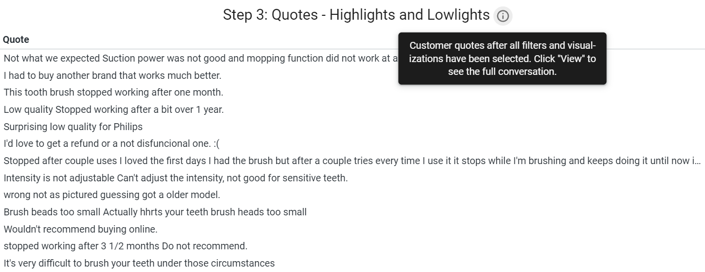
Most visualizations will have tooltips next to the title which explain how various components of the visualization work.

Cross Filtering
Nearly all dashboards allow you to select an entity to filter by that content. Doing so will filter out any conversation that does not include what you clicked on. You can click on words, structured data, people - just about anything you see on the dashboard.
Setting alerts
All visualizations contain a bell icon on the top right.

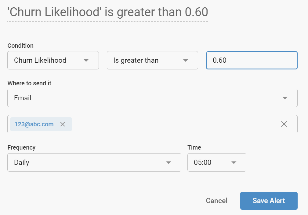
Once clicked, you can select any field(s) in that visualization and dictate thresholds at which to send alerts. Alerts can be sent via email to any recipient at the desired interval.

Scheduling reports
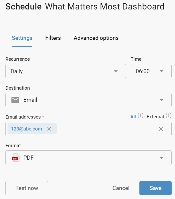
Entire dashboards can be sent as needed or configured on a schedule. You can set the dashboard filters and / or use cross filters to display the data as desired, then click More -> Schedule delivery to configure.

Reports can be formatted as images, PDFs, or CSV files and can be configured with a variety of dashboard filters and / or cross filter. Reports can be sent via email to any recipient at the desired interval.

Sentiment
Sentiment is shown in various locations of the platform. Its spectrum ranges from -100% to + 100% and indicates how certain the platform is that a term, statement, or conversation is positive or negative. For example, a score of -60% would indicate that the platform is 60% certain the data reflects negative customer sentiment.
Sentiment scores are calculated based on how terms are being used. So a term such as "price" would be scored negatively if the feedback stated "the price is too high". Conversely, it would be scored positively if the feedback stated "the prices are great". Therefore in a given data set, the term "price" would receive a variety of different sentiment scores, the average of which is displayed and would change when different filters are applied.
For example, if the term "price" is shown with a positive sentiment score of 80%, we can conclude that, on average, people speak positively of "price" in the current data set. That does not mean that everyone is happy about price; there are certain cohors (say, customers who have cancelled their subscription) which would almost certainly surface "price" with a lower sentiment score. So if you were to filter a dashboard to show only inactive customers, most likely the "price" sentiment would be lower.

Comments
0 comments
Please sign in to leave a comment.