Choosing What to Display
- Connect Delighted to SupporTrends as described here.
- Log in at https://platform.supportrends.com
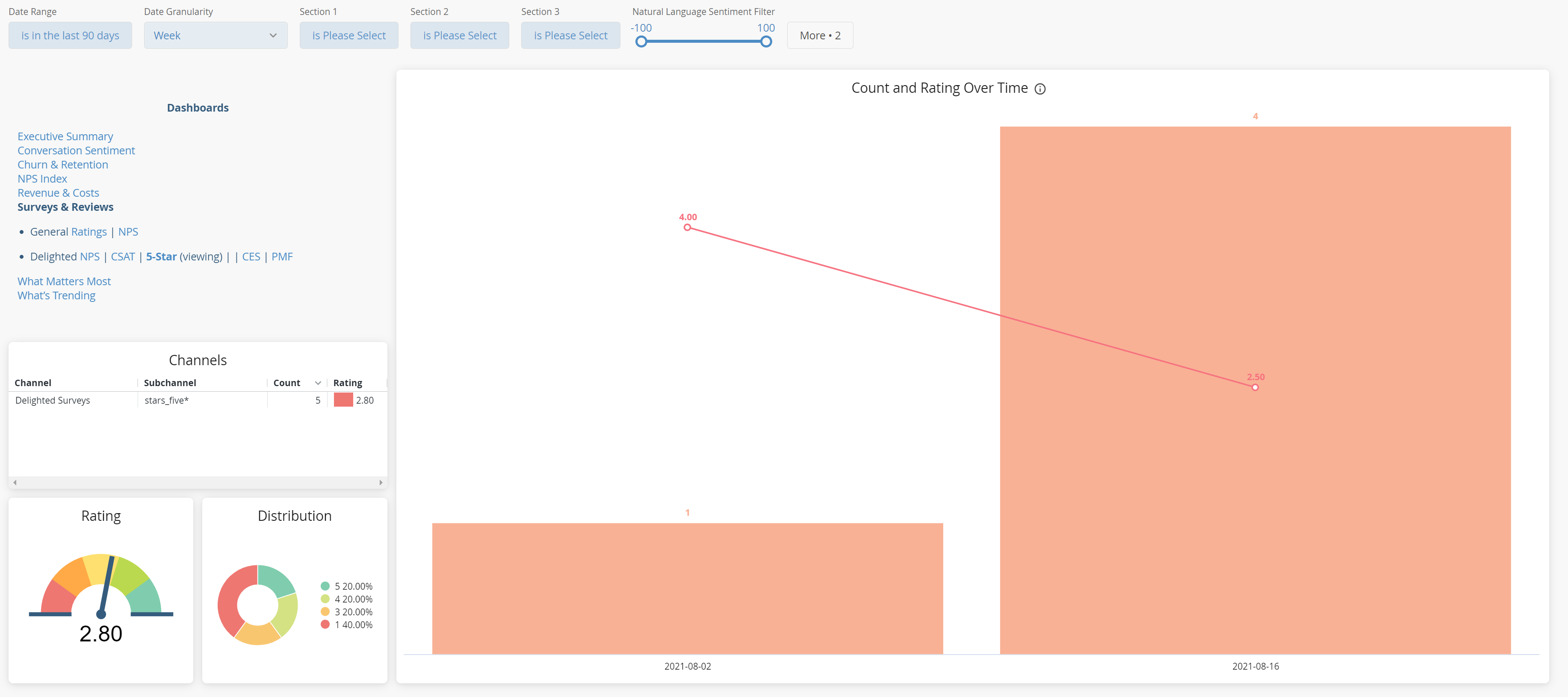
- Select Insights -> Visualizations. By default, surveys from the most recent 90 days are shown.
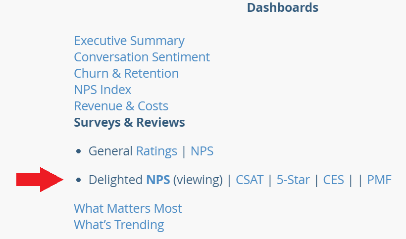
- The default dashboard shows NPS responses. You can chose the dashboard of your preference based on the Delighted survey types that you use, on the top left nav section.

- Adjust filters as needed to display the date range, date increment, quantitative survey questions, and / or metadata that you would like to visualize or filter with.

- Click Refresh on the top right (circular icon) to see your results.
Survey Analysis
Summary
Once your date range and filters have been selected, the dashboard will fully populate. Depending on your survey type and dashboard selected, you will see surveys over time, average rating, and rating distribution in the top section.

Any item (such as a rating value) can be selected by clicking the visual element, which will filter for that element. For example, if you select "4" from the Distribution visualization, your dashboard will display only those surveys rated a 4.
You may select multiple elements from a visualization by holding down Command (Mac) or CTRL (PC) while selecting an element.
Natural Language Exploration
The next section displayed is arranged into 3 steps: Free Response question selection, What is Being Discussed, and Detail.
Step 1 (Free Response) allows you to select any of your Free Response questions in your survey data set, as well as showing the average response sentiment for each. You can select one or many questions to display by selecting the question itself. Responses to all questions are shown by default.

Steps 2 (What is being discussed) and 3 (Detail) display the resulting content filtered in Step 1 above. There are two additional columns in these visualizations: Rating (for surveys with ratings; NPS, CSAT, etc. surveys display their respective survey metric instead) and Influence.
- Rating (or other metric) displays the average rating for all surveys which mentioned that topic or theme.
- Influence displays the importance of the topic or theme, determined by SupporTrends algorithms that include frequency, sentiment, and salience. Items near the top of these lists are likely to be more important to your customers (for positive reasons or negative reasons) than items near the bottom.


You can adjust the sentiment focus of the Natural Language Exploration section via the Natural Language Sentiment Filter at the top of the dashboard (all positive and negative feedback is shown by default).

The Responses visualization displays all of the responses to the Free Response questions that have been filtered for.

Quantitative Fields and KPI Correlations
The fields selected in the dashboard filters determine the content displayed in this section. Content shows the entities in category selected, along with count and average rating for each. KPIs display the KPIs triggered in the selected survey set. KPI Correlation and KPI Correlation Visual show the relationships between the entities and KPIs, numerically and visually, in the selected data set.


Comments
0 comments
Please sign in to leave a comment.